Vowel Cube Formant Chart

Diagram of articulatory cube of vowels projected onto a formant frequency chart.

Characteristics of vowels, such as those of the International Phonetic Alphabet, are typically plotted on a flat chart by their first and second formant frequencies or by qualities such as front, central, back, close, mid and open along the axes. The two dimensional charts with articulatory features as axes typically show the vowels in a diagram with vowels having one of the articulatory features in common being joined by a straight line, usually such that the space of vowels is bound by a quadrilateral or a roughly triangular shape. Sometimes the distinctions between the vowels are displayed in a three dimensional plot with the acoustic properties of the first, second, and third formants as axes or by articulatory features with the three axes as frontness, height, and roundness. While the plots in two dimensions by the first two formant frequencies are often compared to those in which height and frontness are the two axes, comparison of articulatory and acoustic plots in three dimensions are not so usual as a method of teaching phonetics.

On the Base Dozen Forum there is presented a portrayal of vowels in a three dimensional plot by articulatory features of high versus low, back versus front, and rounded versus unrounded as the three axes. The space of vowels is let be a cube with extreme vowels at its corners. For example, the most high and rounded back vowel is one of the corners, and the lowest and furthest back unrounded vowel is another corner. Another corner is allocated to the most high and front unrounded vowel. These are three of the standard cardinal vowels proposed by the phonetician Daniel Jones. In the three dimensional space that is here proposed, these three cardinal vowels form the vertices of an equilateral triangle in the cube. To the other corners are assigned vowels according to the resulting articulatory dimensions of the axes aligned with the edges of the cube. Apart from vowels at the corners of the cube, other vowels of intermediate qualities are plotted between the corners, either along the edges or on the faces of the cube. At the centre of the cube is a schwa.

To compare this cube of vowels by their articulatory features to their acoustic properties on a formant chart, the cube is transformed by rotational orientation and scaling before it is projected onto the planar formant chart. The result is that the positions of the projected vowels agree extraordinarily well to their positions by their measured formant frequencies. Using the outlines of the edges of the projected cube, it is possible to predict the effects of changes in articulation on the acoustic qualities of the vowel. This should make this proposal more useful for understanding what a vowel will sound like in relation to known vowels than an ordinary chart in which unrounded and rounded vowels having the same features in other respects are merely placed beside each other in pairs without indicating how their formants differ, although it is expected that rounding applied to front vowels or unrounding applied to back vowels will centre them acoustically.

Diagram of articulatory cube of vowels projected onto a formant frequency chart.

References:

https://dozenal.forumotion.com/t87-vowel-cube

Dozenal Numeral Ten

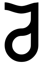
I have designed a glyph for the numeral ten to be used in base twelve numeration. Various characters have been used historically for the digit ten in base twelve numbers. One of the earliest used by a dozenal society is the Pitman turned digit two, based on the initial letter t of the word ten. Various conventions have been tried for the letter to be used for the numeral ten. One is the letter A, part of the system of transdecimal extensions to the Indo-Arabic digits used for hexadecimal numbers and called IBM computerese by dozenists. This scheme is considered to emphasise base ten as the ace of bases too much for dozenists by the first letter of the alphabet starting on ten. Another option is the letter J because it is the tenth letter of the alphabet. Yet another proposal is the letter d standing for dec or dek meaning ten. In recent years, some dozenists have begun annotating that numbers are to be read as written in base twelve by suffixing them with a subscript letter of the alphabet. This means that in order for dozenal numbers to remain distinct from decimal numbers, the decimal numbers need to be annotated with a literal suffix. However, these are not standard practice in formal mathematical literature, where bases are annotated when distinction between bases is necessary by digits in decimal format rather than by letters of the alphabet. The most popular numeral for ten among dozenists currently is the Pitman turned two ever since it entered Unicode. As such, this symbol can be interpreted as a numeral and not just a letter, bringing it into line with conventional mathematics.

My design is based on all of these literal characters for ten. Firstly, it is derived from the Pitman turned two by closing the curl in order for the character to have a distinct seven-segment modular element display. This fixed one of the disadvantages of the original unmodified Pitman turned two whereby it looked too similar to other numbers or characters, including the numbers two and seven, and the letter zed. However, closing the loop resulted in a figure that looked too similar to a style of the digit three having a horizontal top bar. To improve this issue, the next stage was to make the numeral look more like the tenth letter J of the alphabet while still resembling the Pitman turned two by a horizontal top bar and closing curve with the end meeting onto the partial stem. The present latest version modifies this further by making the join of the closed curve attach to the partial stem tangentially upwards. The resulting glyph can be written by hand quickly and effortlessly without lifting the implement from the page until the digit is complete. Additional bonuses are that it conveys a lower case letter d and double story letter a. Thus, my design proposal solves most of the conflicting usages of different letters for the digit ten by merging them all into one character. This character remains distinct enough from other alphanumeric symbols and glyphs to retain its unique meaning dedicated to the numeral ten for numeration using base twelve.

Further benefits of my design are that it has cues of the digits five and two that are the prime factors producing the number ten. As well as the turned digit two derived from the Pitman turned two, it contains a reversed digit five. Another effect is that a horizontal line and a closed curve suggest the numerals one and zero of the number ten in decimal format joined together and written vertically. This may increase subliminal identification in a transition from decimal to dozenal notation.

In summary, my design for the numeral ten for dozenal numbers satisfies the following inclusively:

  • The initial letter t of the word ten from the Pitman turned two;
  • The initial letter d of the morpheme dec or dek for ten;
  • The tenth letter J of the alphabet;
  • The letter a in lower case double story style from IBM “computerese”, often used for the numeral ten in hexadecimal numbers;
  • The decimal digits 1 and 0 forming the number ten in decimal format joined together and written vertically one under the other; and
  • The digits for the prime numbers two and five of which the number ten is composed as the product.